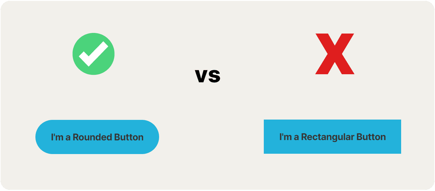
The types of experiments that I find to be the most interesting are those where a small, simple change leads to a statistically significant learning. I’ve run several A/B tests of this kind myself, including testing button CTA text variations as well as the impact of a simple heading on a page that didn’t really need one. Recently, I read about a study on button CTA shape, something I’d never considered testing before, and the findings of that study were fascinating.
Rounded Buttons and Clickthrough Rates
In December 2023, a study published in the Journal of Consumer Research conducted multiple field experiments and an eye tracking study. They concluded that using rounded or curved visual elements drive higher clickthrough rates and in some cases, significantly so. In fact, one of the experiments involved an event planning company that tested using rounded buttons vs rectangular ones and found that rounded buttons achieved a 56% higher clickthrough rate!
One of the other experiments in the study involved a hotel chain that ran a split test where half the traffic was sent to a landing page with curvy buttons, and the other half to one with standard, rectangular buttons. The landing page variant with the curvy buttons not only received greater engagement, but also experienced a 15% increase in average order value (AOV) relative to the control!

Conclusion
In retrospect, this actually makes a lot of sense. Though not intentionally, you’ll notice the shapes that I use in components on MeetKeith.com are rounded. My button CTAs are also curved, as I use a 30px radius on them. I didn't consciously make them this way because of the study, I honestly just liked the way they looked and felt. After all, I don’t know anything about design theory. But after reading about this study, I did a little research on the use of curves in design, and learned that roundedness is used by designers because users perceive it to be friendlier, and more inviting, as well as approachable and safe. In contrast, as a form of self-preservation, our natural instincts can actually deter us from interacting with sharp, cornered objects.
As always though, resist the temptation to start writing up work requests to change all of your boxy, sharp, rectangular button CTAs to a more curved design, and just try testing it first. But, if you don’t have the means to test, or perhaps you're pressed for time, just go with rounded buttons. The data, and nature, is heavily on your side after all.
© 2025 Designed and built by Keith Mura.

