Evolving a Trial Signup Experience Through Iterative Testing
CRO
2
min read
Background
This project was completed during my time as Senior Web Marketing Manager, GoTo Resolve at GoTo Technologies (formerly LogMeIn) where I worked from 2021 until 2024.
GoTo Technologies is a cloud-based communication, collaboration and IT management SaaS company that offers trial and paid subscriptions to products including GoTo Connect, GoTo Meeting, and GoTo Resolve.
Challenge
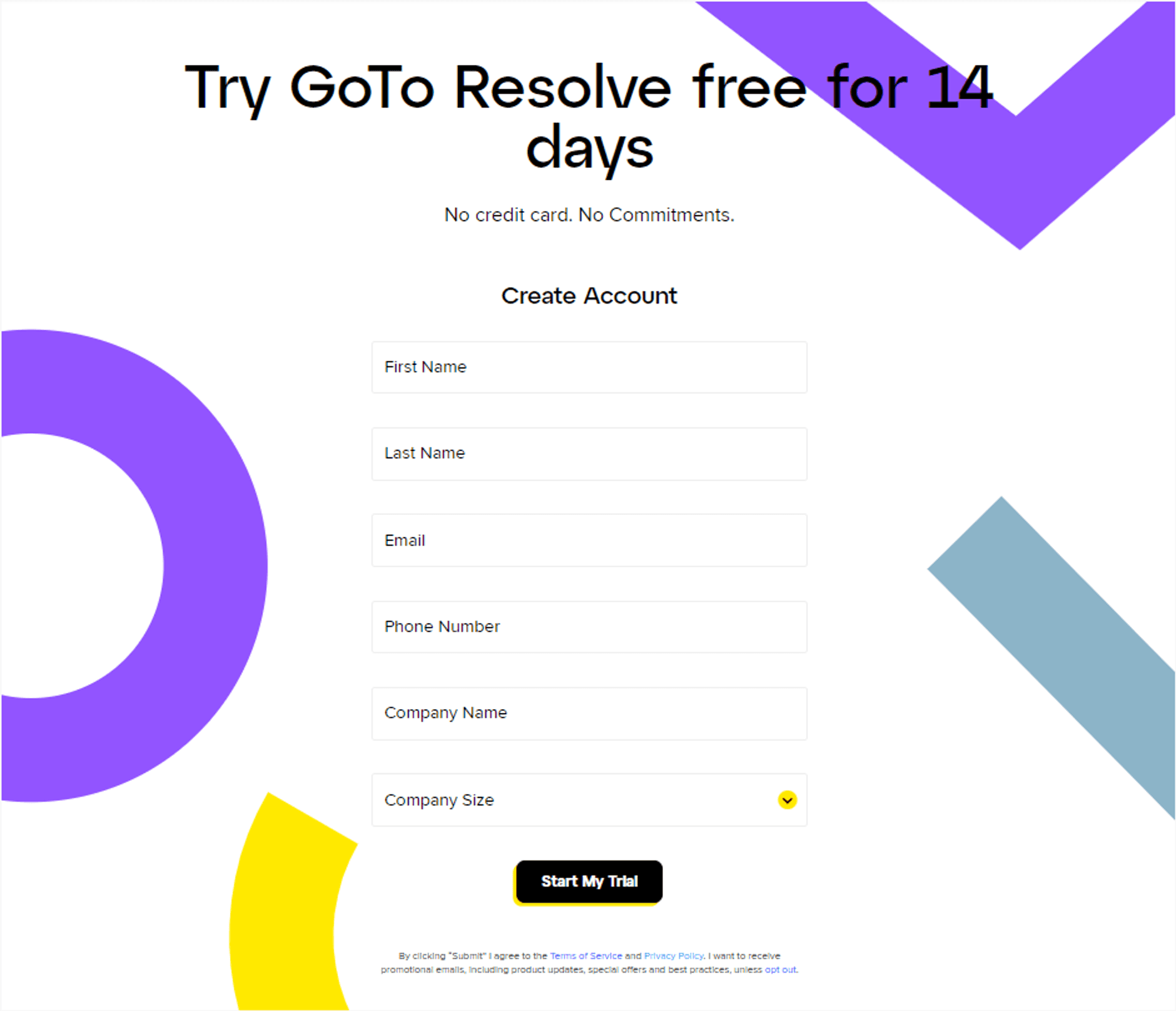
In order to get GoTo Resolve live in Feb 2022, we had to launch simplified versions, or MVPs, of many of our core flow pages. One of these was the trial signup page, where users provided account details in order to get started with a free trial version of GoTo Resolve. My team started with a simple, baseline UX like the one below with a plan to launch a series of iterative tests to optimize its ability to sign up users.

Solution
To improve the trial form completion rate, I worked with the team to run a series of A/B tests to identify factors that positively impact the likelihood of a user completing the signup process. We would test a wide variety of elements including:
Form Copy
Form Fields
UX
Supporting Content (images, additional messaging, etc)
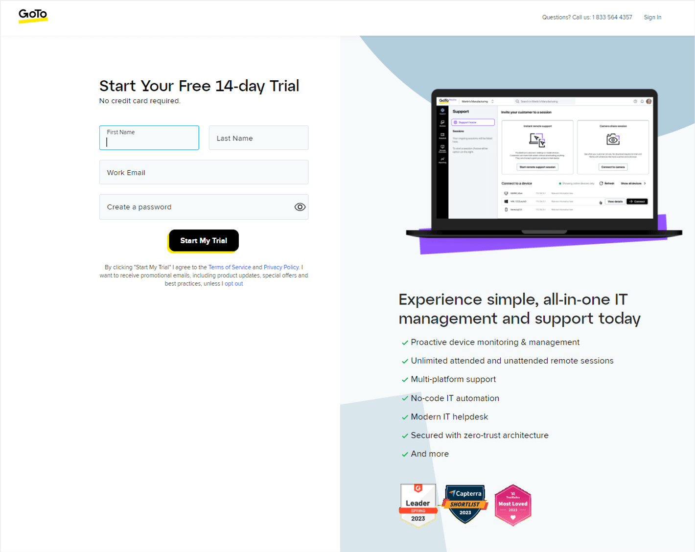
Winning elements would remain and we’d continue to test out new elements thereby evolving the trial form experience over time as we discovered elements that worked. Here is what a more optimized variant of the GoTo Resolve trial signup page looked like:

Results
Through continuous testing, we were able to successfully evolve the simple trial form into one that users were 30% more likely to fill out. This was achieved through tests that included:
Reducing the number of form fields
Use of supporting copy
Adding social proof
Key Takeaways
Reducing the actual number of required form fields helps.
Reducing the visual number of form fields also helps. Instead of stacking the first and last name fields for (4 fields on 4 rows), we combined them into a single line (4 fields on 3 rows), making the form feel visually smaller.
Reinforcing that no credit card is necessary is reassuring for users.
Having form and content go left to right performed slightly better than the inverse.
For images, users preferred product UI over images of people although we did not test this extensively.
Adding relevant, supporting copy reminds users what they’re signing up for.
Third-party badges instill a sense of trust. Customer logos were also effective.
© 2025 Keith Mura


