Hypothesis
On a SaaS pricing page, the size of a pricing card reflects its value in the eyes of the user. A pricing card that is very big is packed with features while a pricing card that is small is more limited in that regard. Using card height as a visual cue acts, to the user, as a proxy for value.
Examples in the Wild
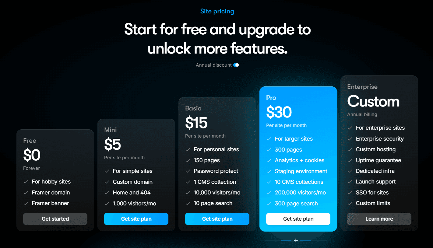
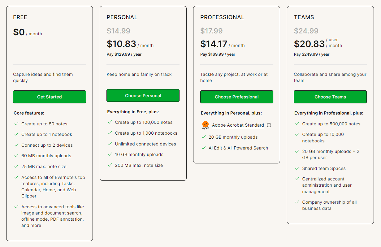
Below are two examples, from Framer and Evernote, of pricing pages that use variable card heights that send different signals to the user.
Good, Better, Best - Card heights that increase as plans get more expensive reinforces the idea that when you pay more, you get more. This approach could help for increasing average contract value (ACV).

Pick Me - Here, the free plan is quite clearly the tallest card, communicating that it is the best value. This approach could help for drawing attention to specific plans such as a free plan for products where conversions are more likely to occur through a free-to-paid PLG model.

Metrics to Observe
Depending on which test is run, I would look at some of these metrics:
Average Contract Value - Did it go up or down relative to the control?
Tall Plan Signup Rate - Did the tallest plan get more signups relative to the control?
All Plans Signup Rate - Was any cannibalization observed relative to the control?
Why It Could Work
Most SaaS pricing pages use cards of equal height. By being different, it could draw the attention of the user
If in the mind of the user, height equates to value, and if all card heights are the same, then more expensive plans have less relative value then less expensive plans.
© 2025 Designed and built by Keith Mura.

